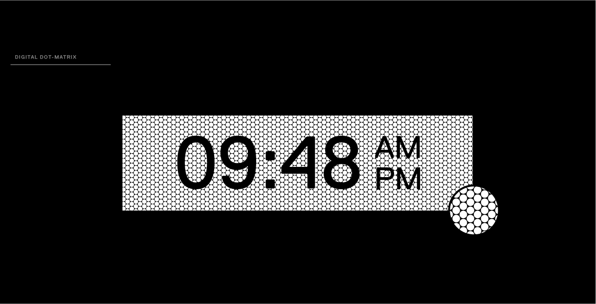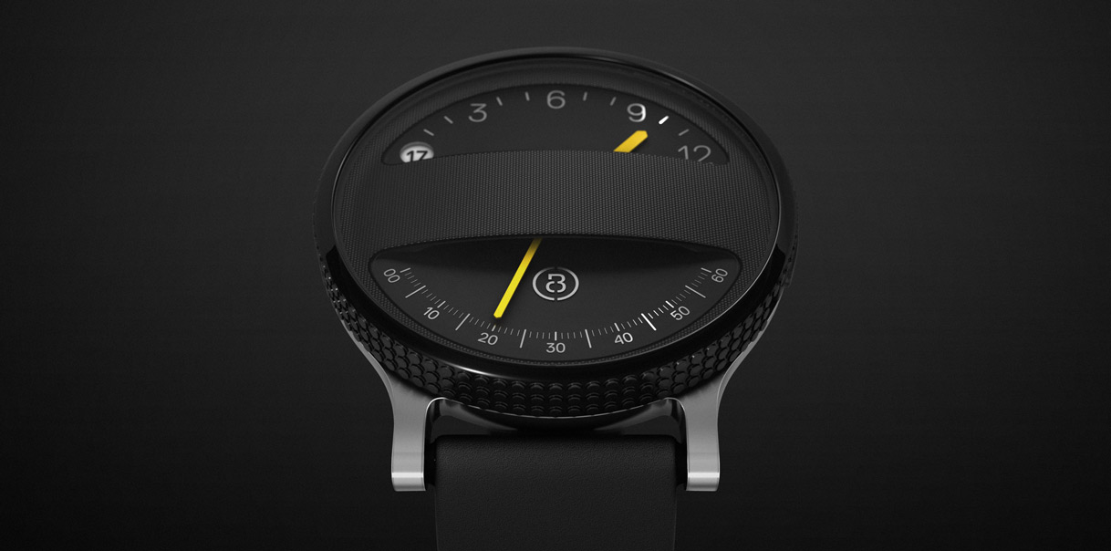
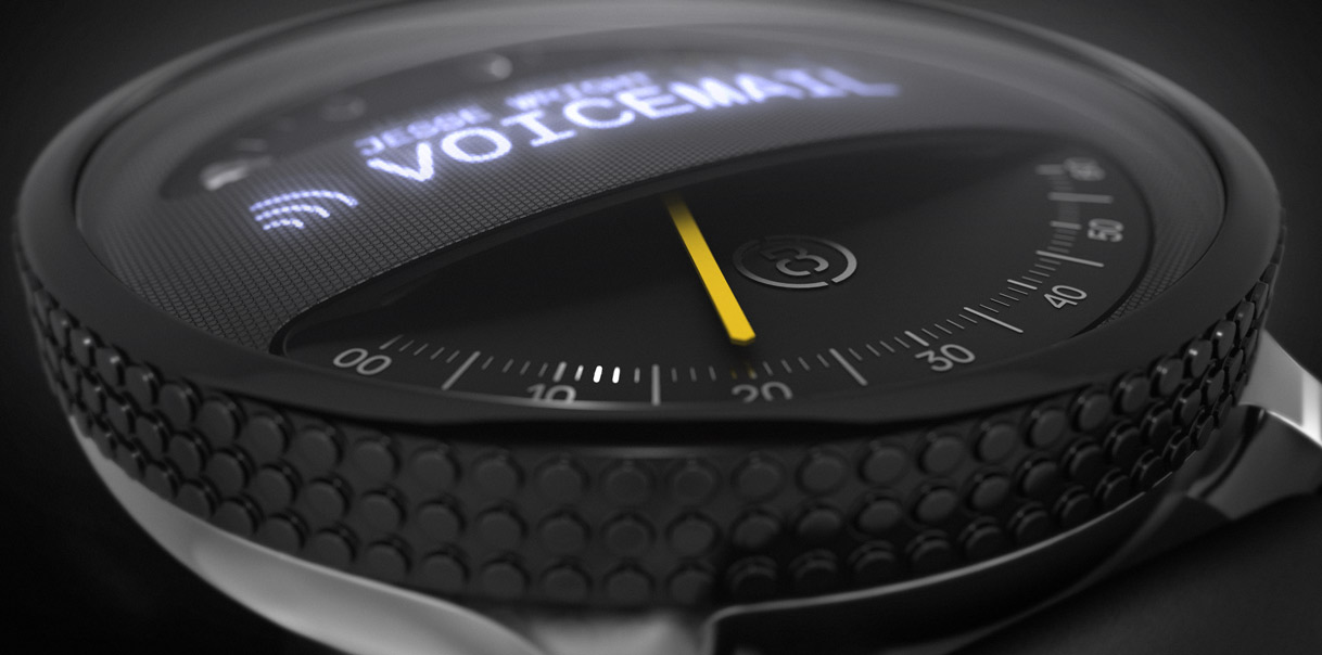
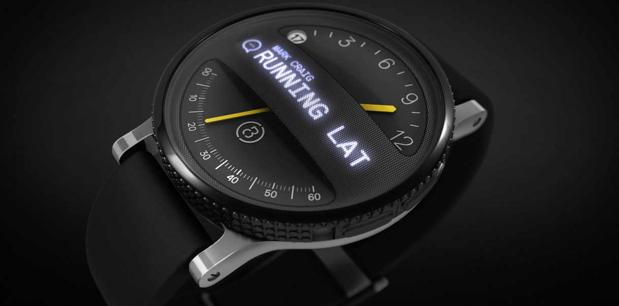
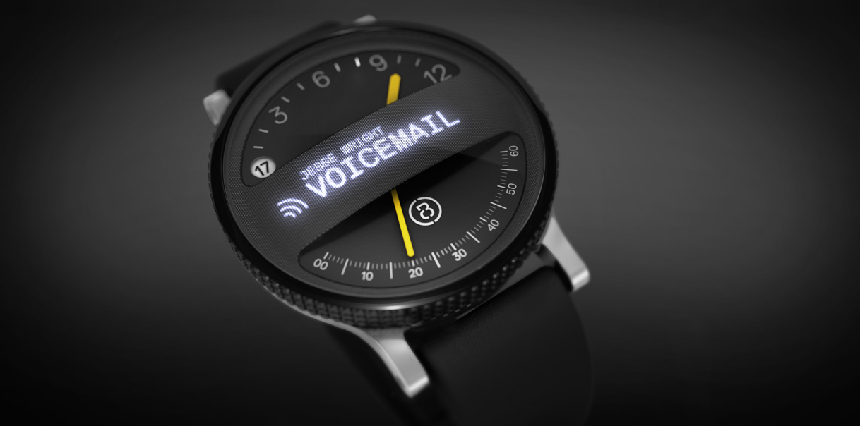
A black mesh band—the digital display—straddles but does not obscure what is otherwise a clean analog watch face, black‑and‑white with yellow hands.
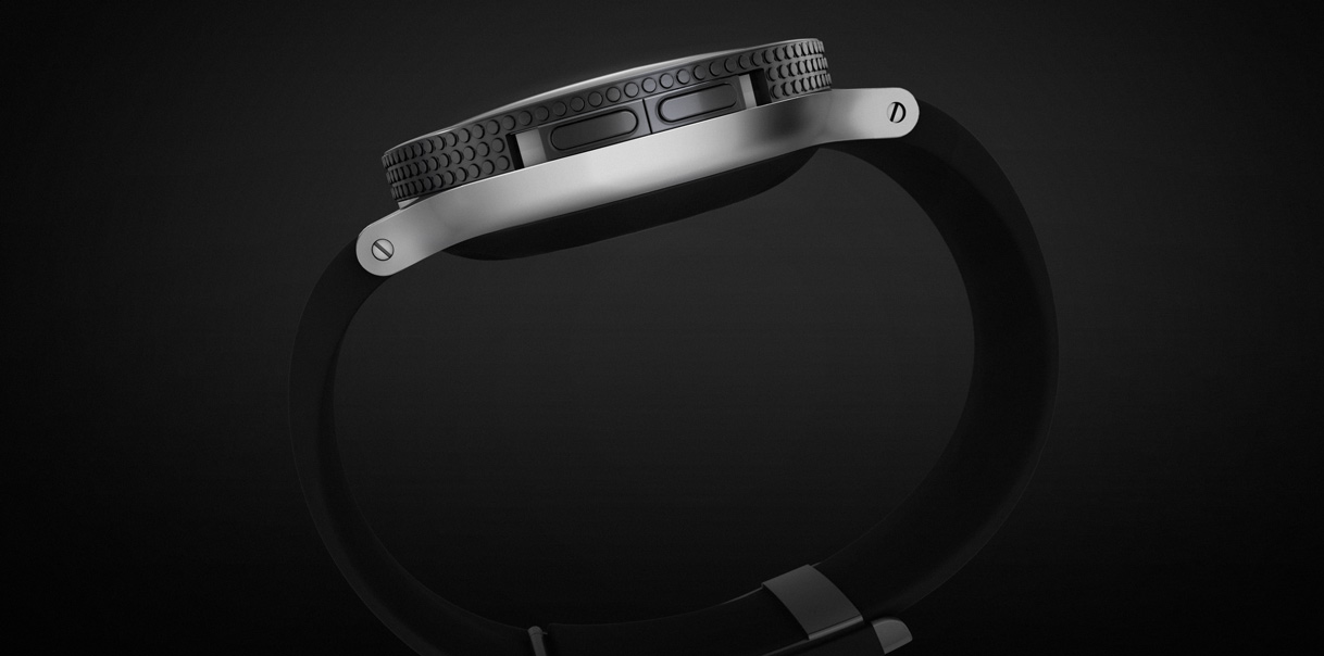
A bezel surrounding the watch face offers fluid jog dial navigation to manage incoming alerts. Span’s jump hour timekeeping operates on a quartz movement; the digital components can be recharged with a micro‑USB charging port concealed in the back of the watch.
Brand Identity Design
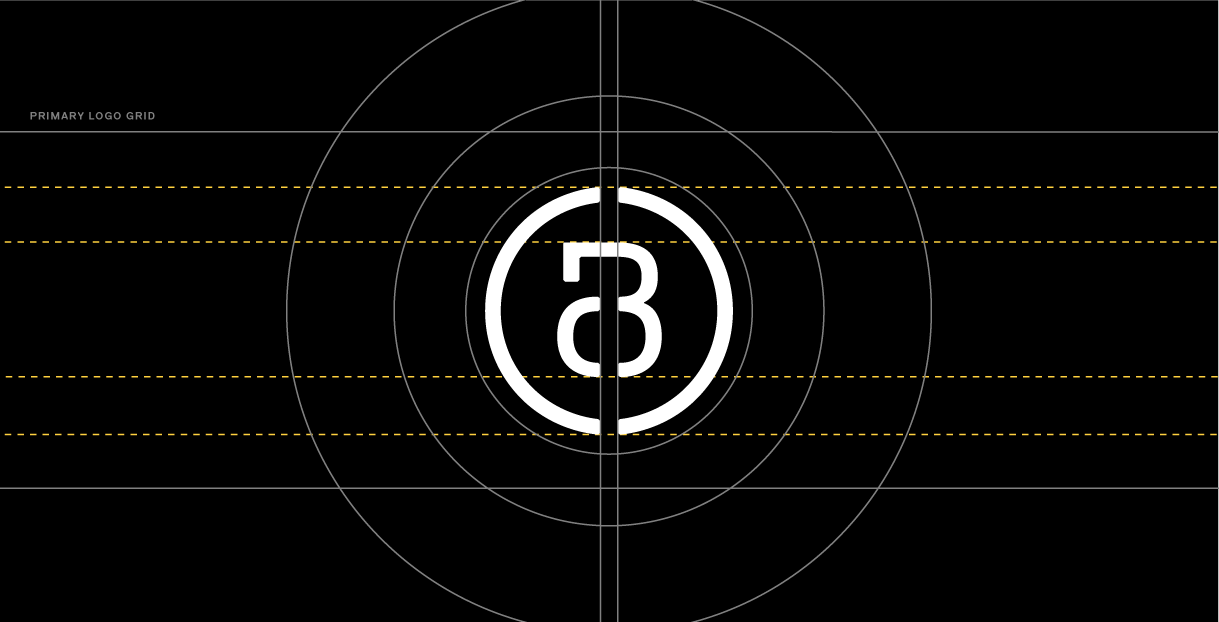
Span's logo speaks to the continuum of time. The bowed arches repeat to present an almost rhythmic form—like time ticking—and, as this was a self‑initiated project, also notion to the letters 'B' and 'C' after our own studio's name.

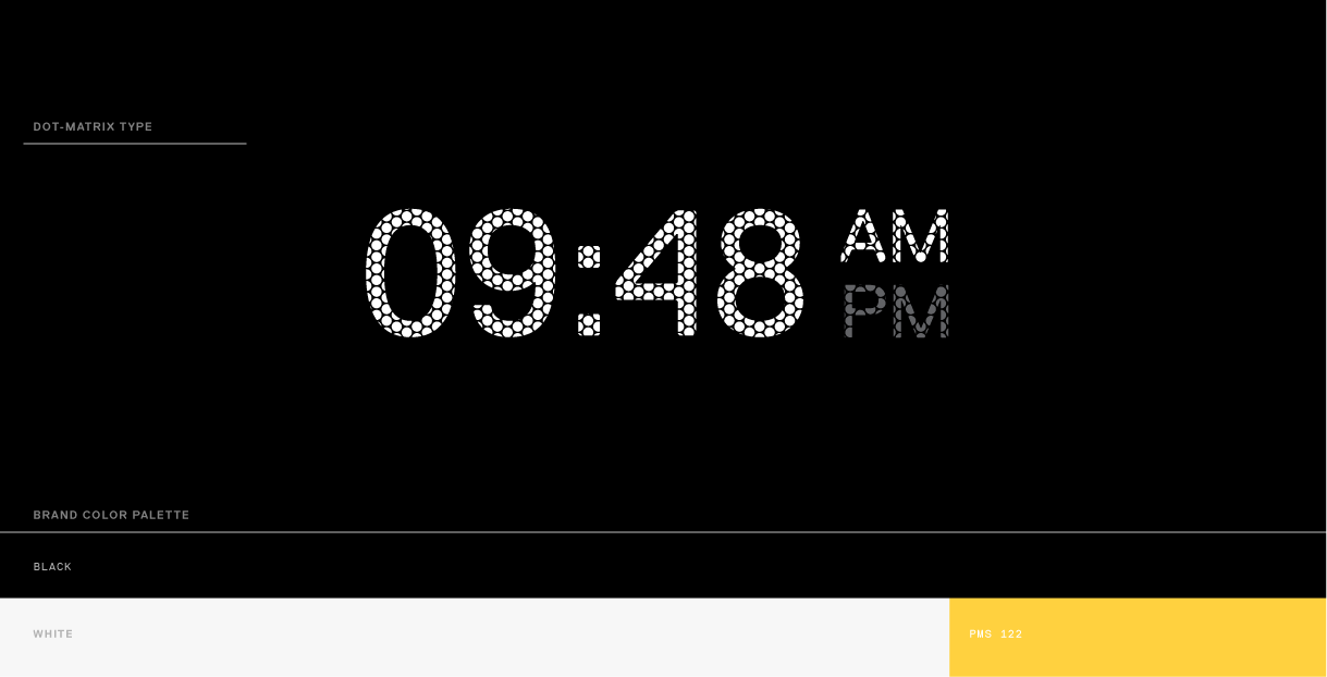
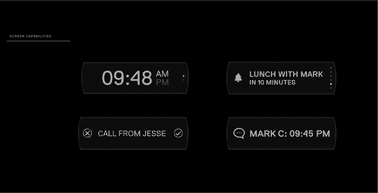
The interface graphics are clean and simple. An unpretentious font keeps information clear despite the digital dot matrix. Graphic icons were designed to remain familiar and legible despite scale.
