
Clip
Payment Design System
- Physical Design Language
- Brand Identity
- Industrial Design
The Client's Challenge
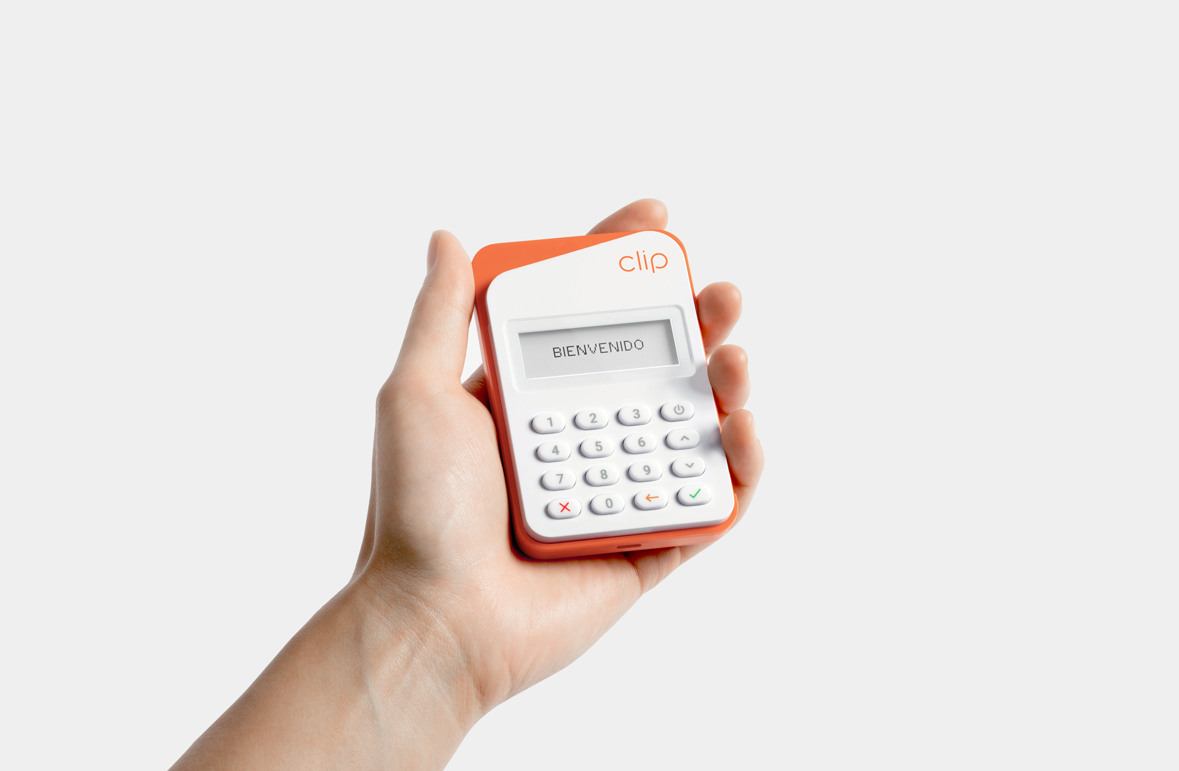
To meet evolutionary changes in mPOS payments technology, our team was challenged to create a next generation flagship device for Clip, optimized for handheld and pocketable use, to extend the design language and reinforce their brand identity.
The Strategic Approach
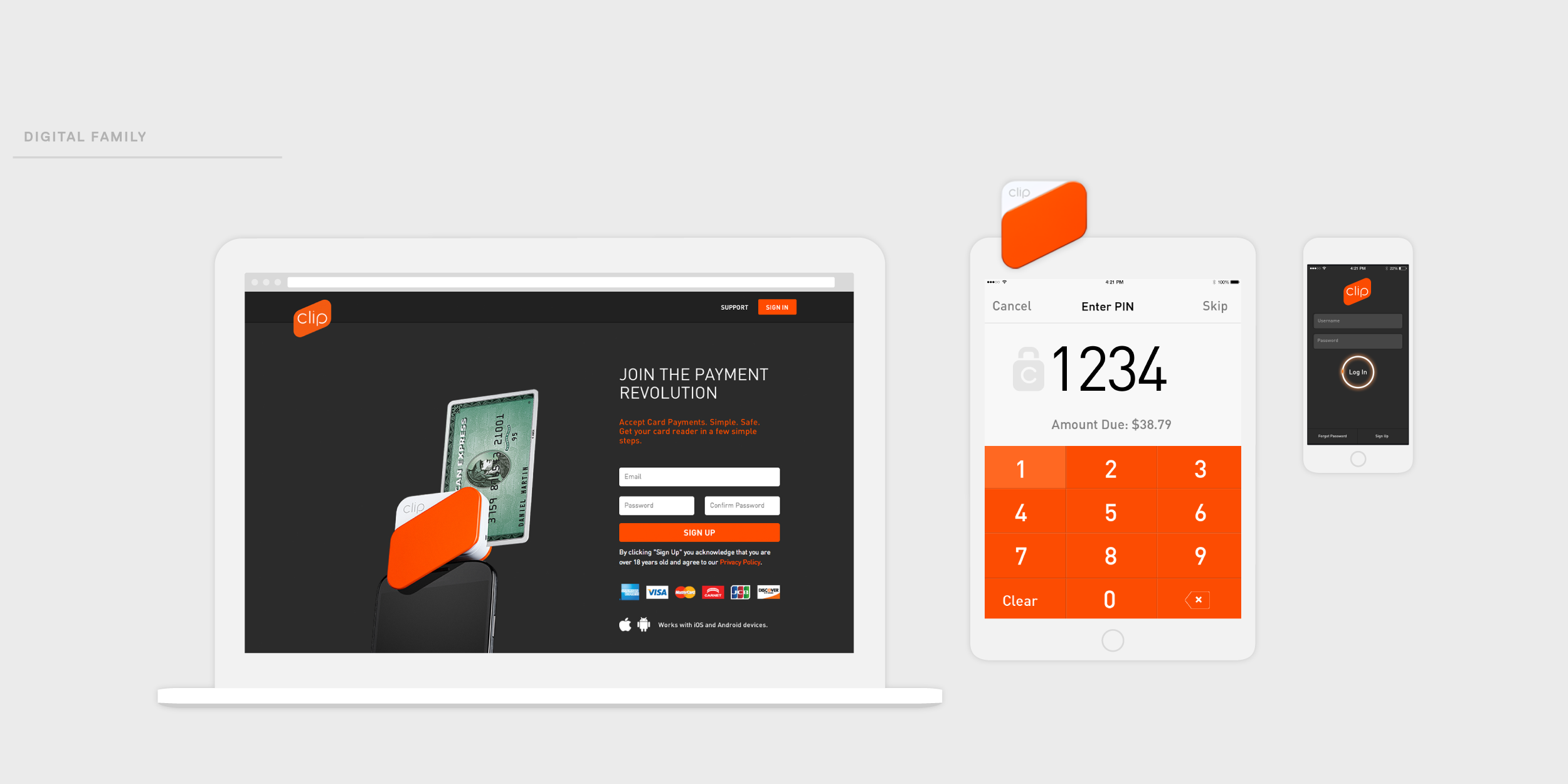
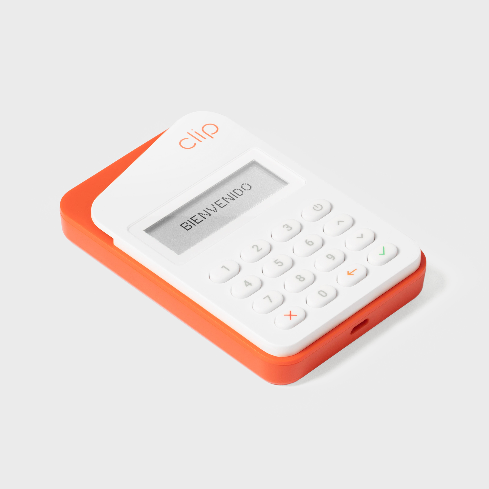
The Box Clever team developed a scalable and flexible design language for Clip that combines a consistent form language, signature details, and the bold yet modern color palette.
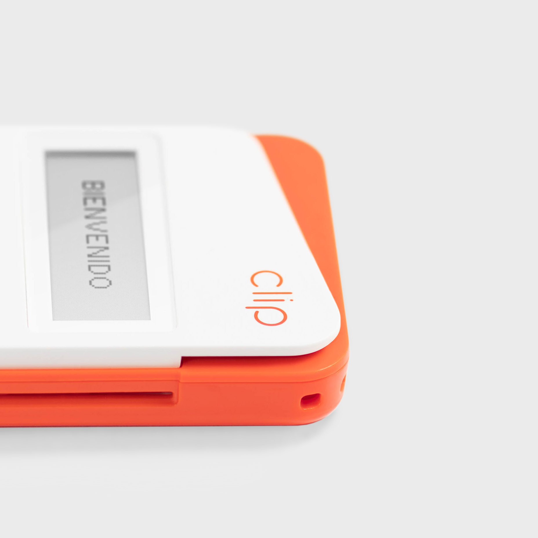
Integrating the signature form of the brand mark into the physical design of the reader was strategically an opportunity to reinforce the brand at every customer interaction.

The Creative Solution
This 3rd generation device was created with its design language heritage in mind, so that it is instantly recognizable within the Clip product and brand ecosystem. It thoughtfully incorporates design details for each of the payment interactions, with an emphasis on intuitive guidance without sacrificing the physical design.
The Business Impact
Launched in 2020 in the Mexican mPOS market to help small business owners adapt to changing industry policies and increase their mobile payment capabilities.
Clip has grown exponentially, became Mexico’s first FinTech unicorn in 2021, and continues to create positive impact.


Brand Identity
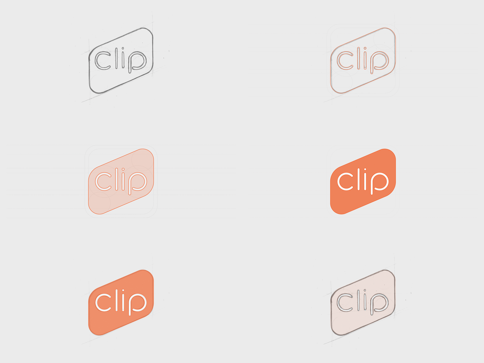
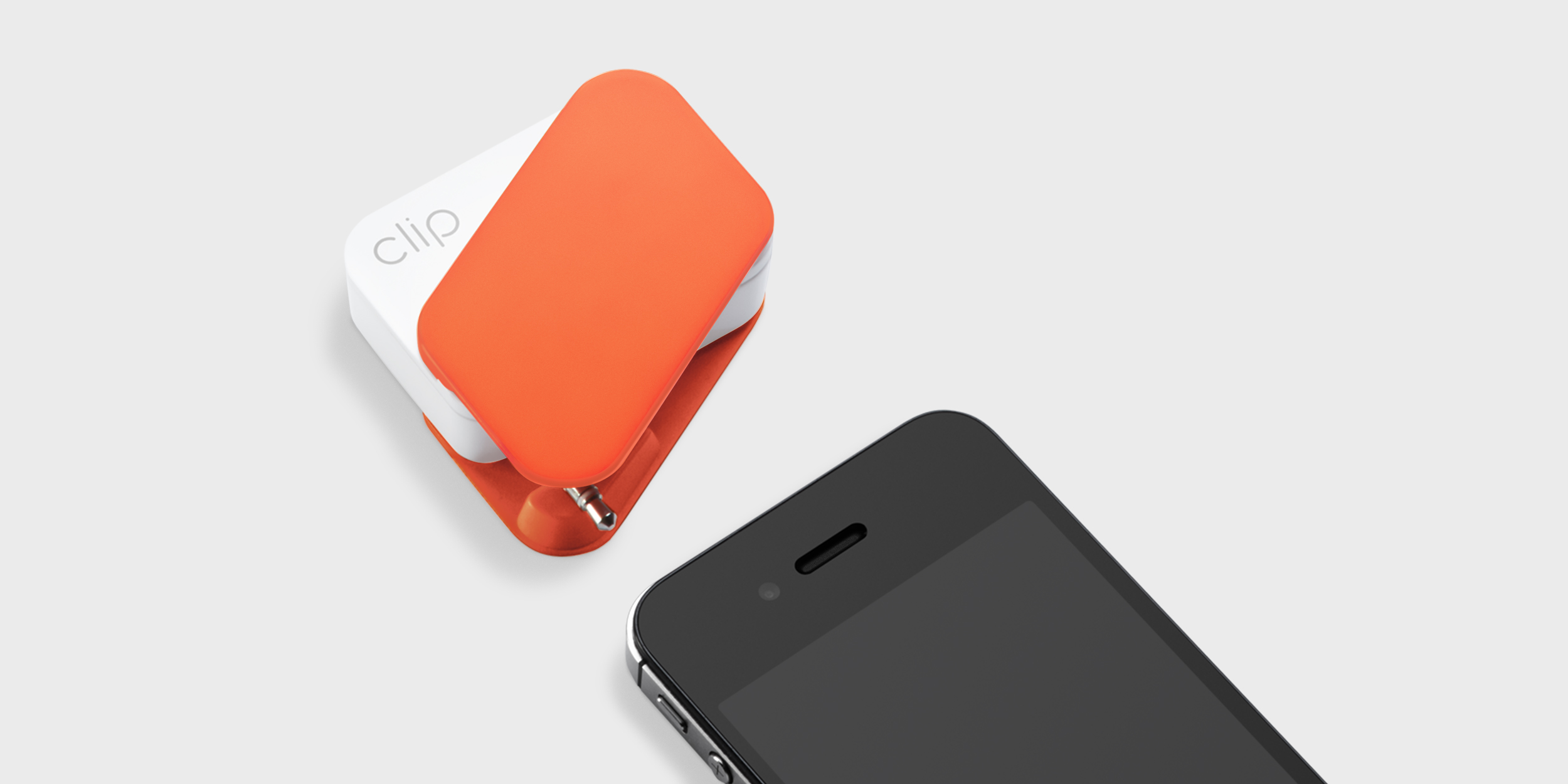
Designed in parallel with the original reader (shown below), the Clip brand identity combines an iconic slanted form and a distinct orange color that represents the empowering freedom that mobile payment can bring to merchants and consumers.
The brand identity has become instantly recognizable in the Mexican market as the mobile payment solution of choice, due in part to the purity of the design and cultural resonance of the color.
