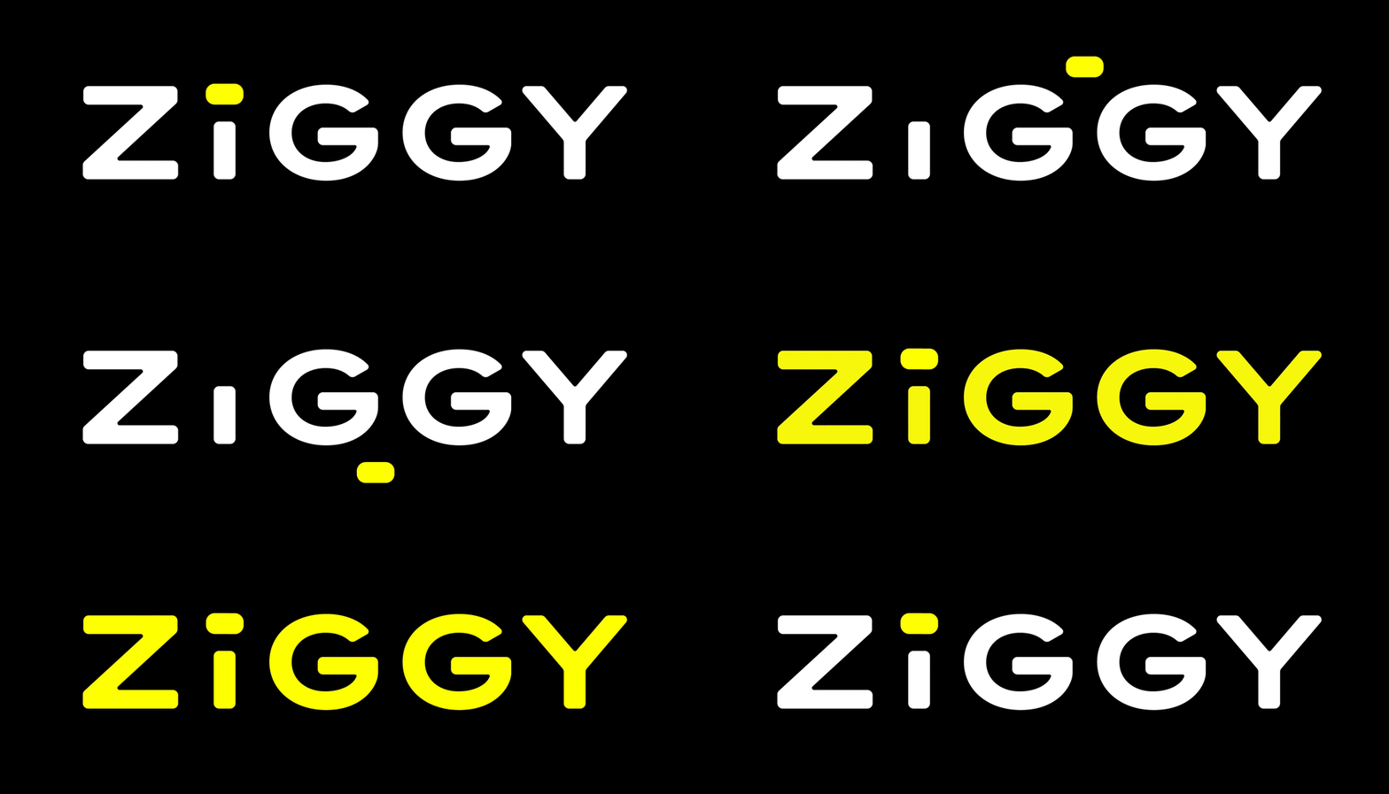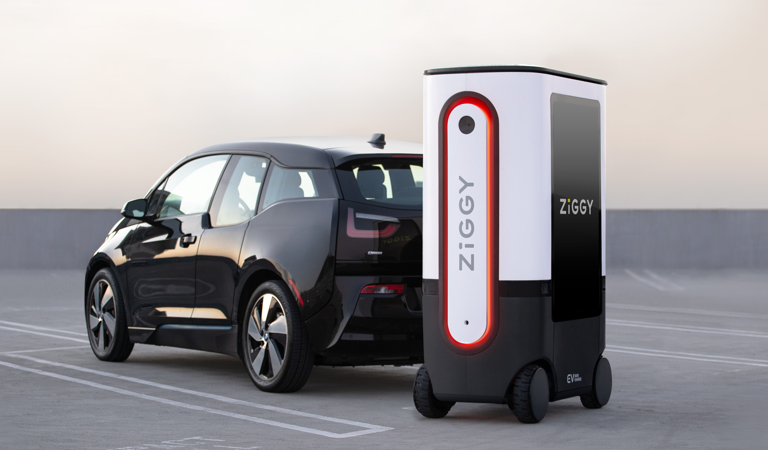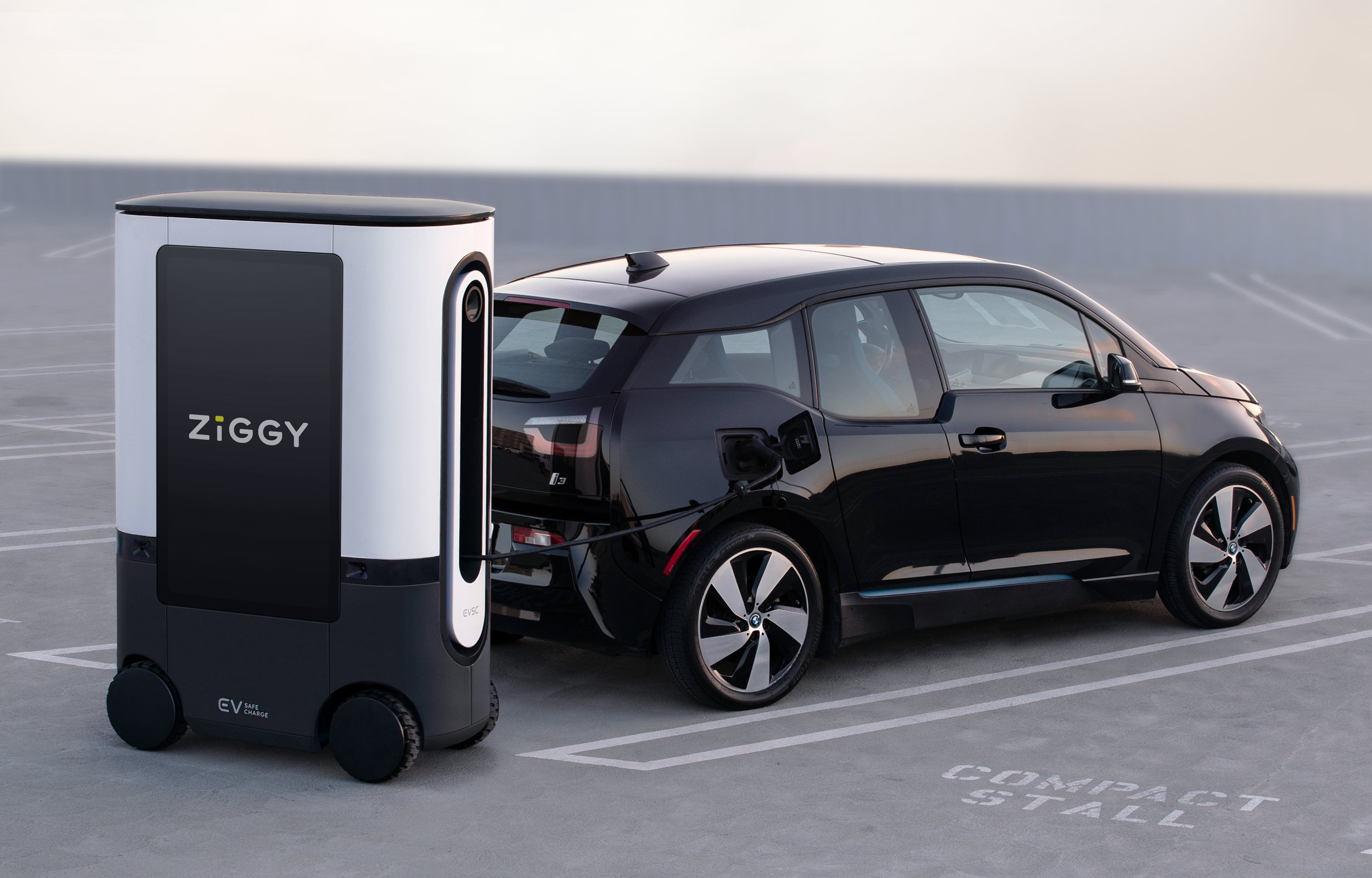

ZiGGY was created by EV Safe Charge to bring a delightful robotic mobile charging experience to every parking space, making EV charging easier and more accessible than ever.
Box Clever’s design work for EV Safe Charge helped bring this mission to life.
When Box Clever first started on this design journey, what excited us the most was the systemic nature of the program, and the realization that we could help design how the future of EV charging will look.
ZiGGY moves beyond the traditional fixed location charging of today and will create a new array of possibilities for drivers, cities, and the charging‑as‑a‑service model that EV Safe Charge is creating with ZiGGY.
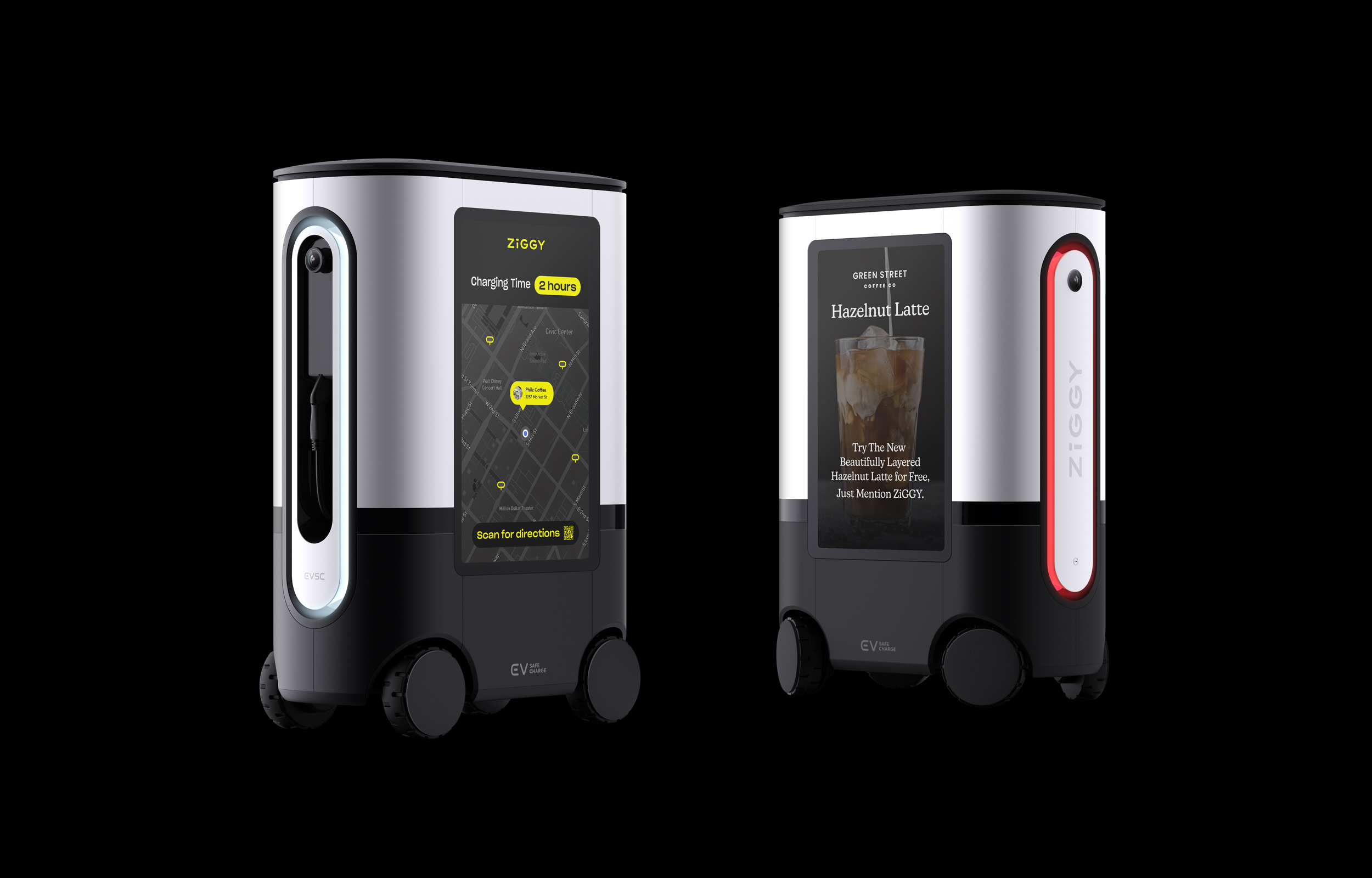
With new experiences it's important to consider how to build trust and confidence among users, making sure to alleviate pain points and prevent moments of confusion. Together, teams from EV Safe Charge and Box Clever considered the levels of engagement with the ZiGGY experience and the critical moments where uncertainty or anxiety could be replaced with trust and confidence.
Collaborating with the EV Safe Charge team, we worked to understand, visualize, and iterate on a frictionless customer journey; this end‑to‑end design approach ensured that ZiGGY has become a holistic experience with personality, one that offers delightful and thoughtful moments.
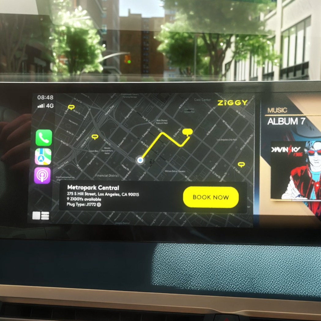
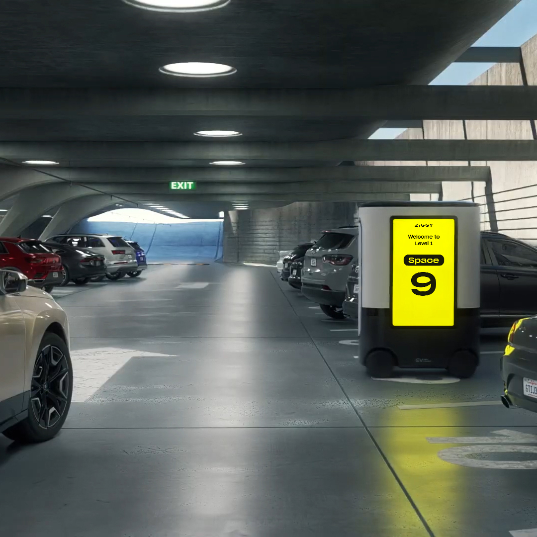
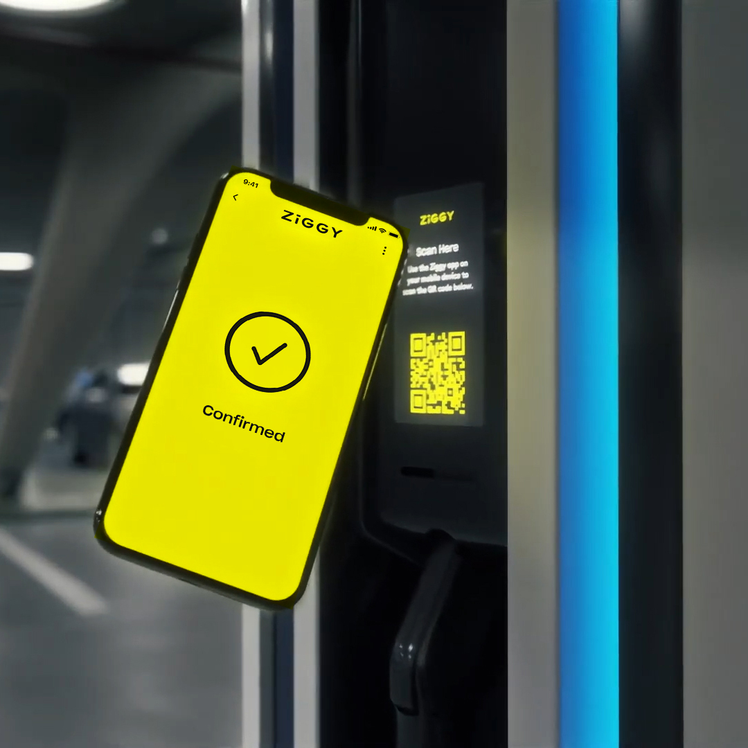
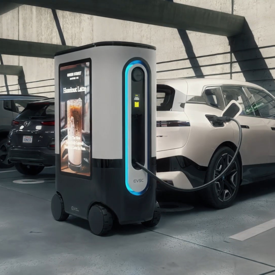
Box Clever’s industrial design for ZiGGY was created to accelerate its adoption, appearing approachable and unassuming without sacrificing functionality. Starting with technical specs from EV Safe Charge, we developed a 1:1 scale mockup to establish proportions, designing around constraints.
ZiGGY’s design combines pure, rounded geometric forms, the removal of any distracting elements, and the visual integration of technology (screens, sensors, cameras).
Box Clever conceived ZiGGY’s physical color palette, darker in the lower half to convey its stability and white in the top half where the user interacts and views more of the product. This helps make it both approachable and visible for safety.
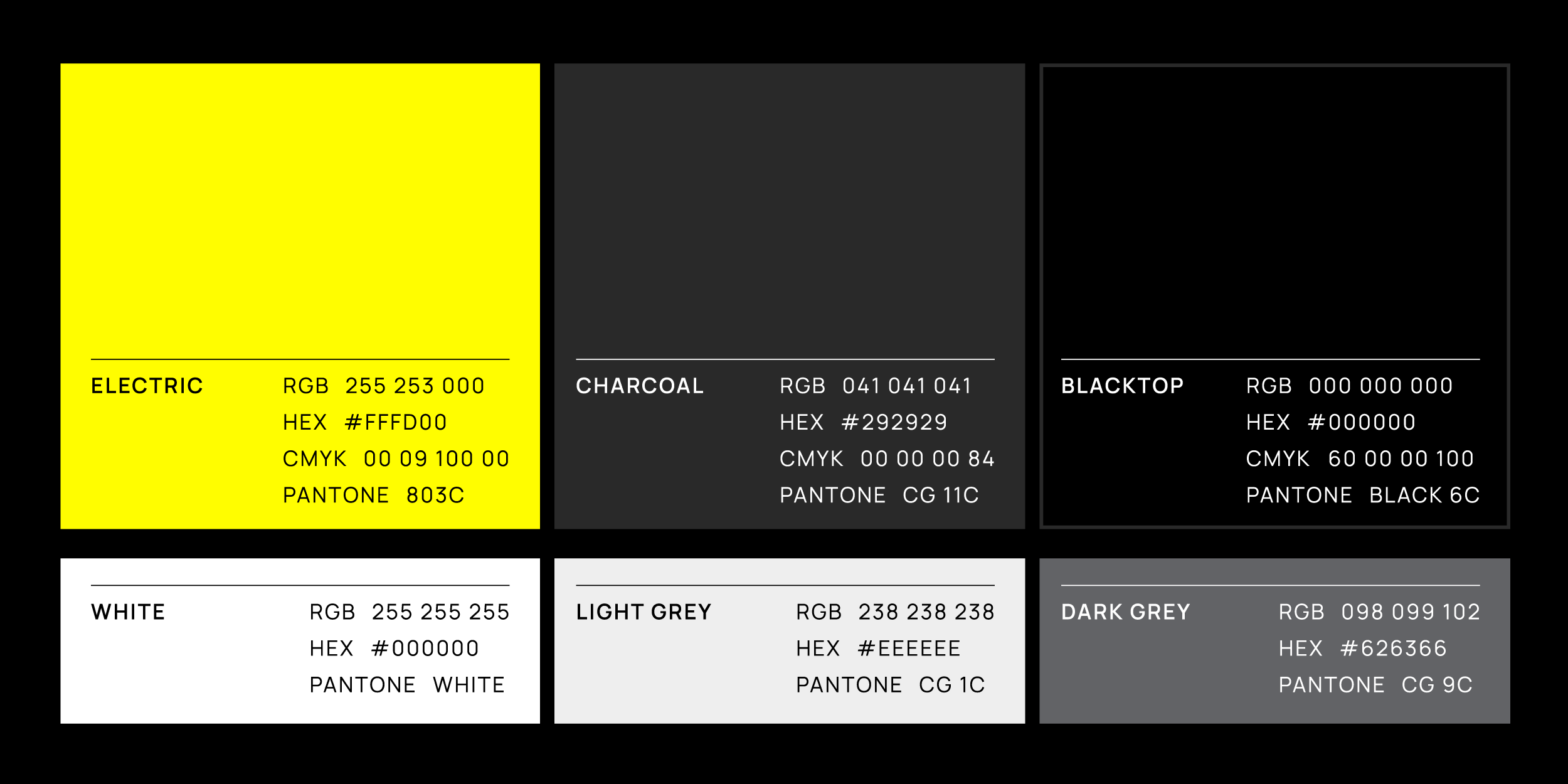
Box Clever developed ZiGGY’s digital Brand Color palette to be complementary to its physical design, continuing the use of black, grays, and white. We also chose an expressive hero brand color: “Energy Yellow,” a positive, energetic color that stands out in the EV charging space.
