Aer
Luggage
- Design Strategy
- Industrial Design
- Physical Design Language
- Creative Direction
Our Partner’s Challenge
Aer teamed up with Box Clever, to create their first Carry‑On luggage case. How might we build a new category for their business and simultaneously create a refreshed update to the Aer DNA for modern travelers?
The Strategic Approach
In a crowded category we needed an ownable approach that felt authentic to the Aer brand. By analyzing their soft-sided visual language, we identified underlying Aer specific elements of silhouette, details, and proportions to create a design foundation for the team to create a premium product.
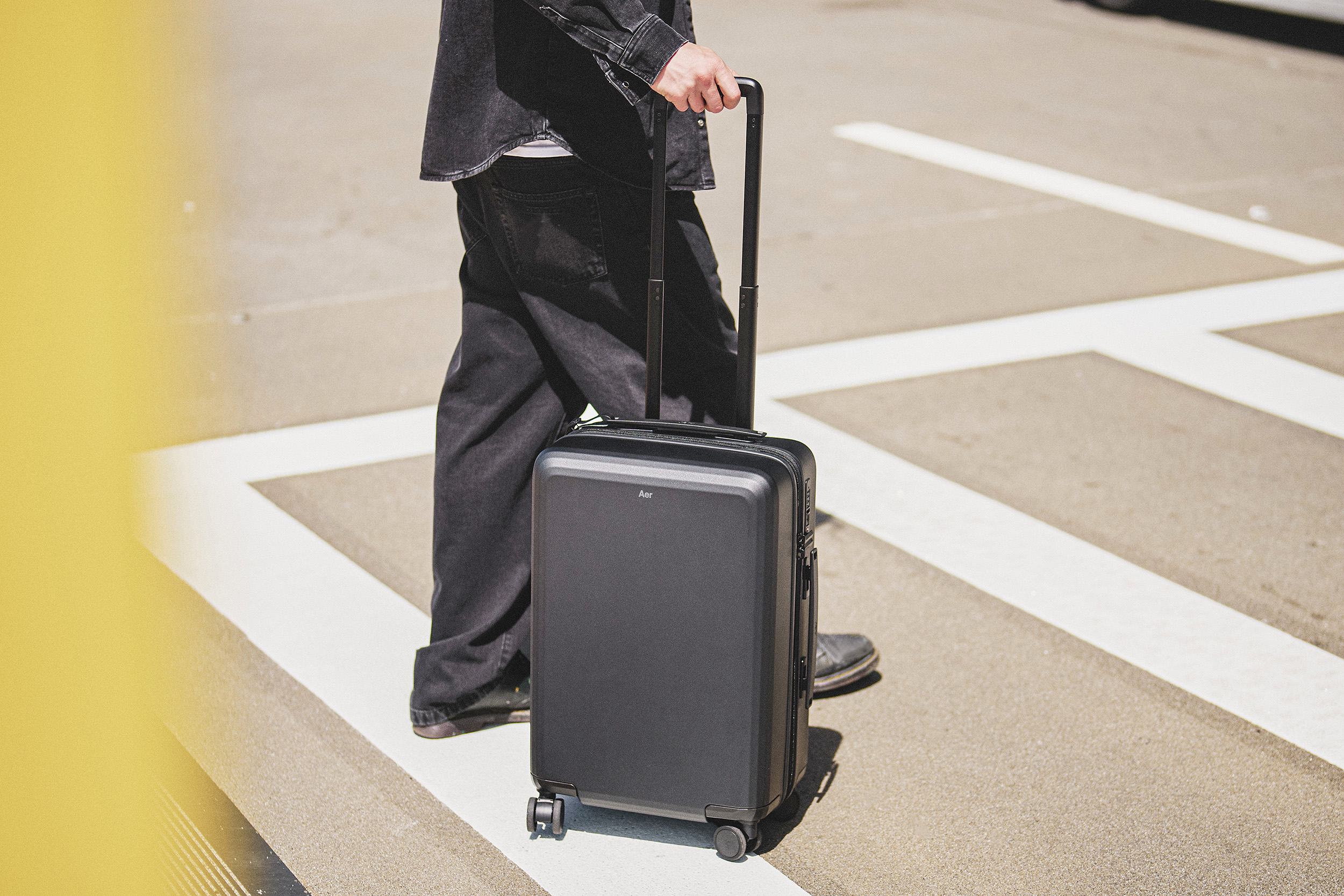

Details. Details. Details.
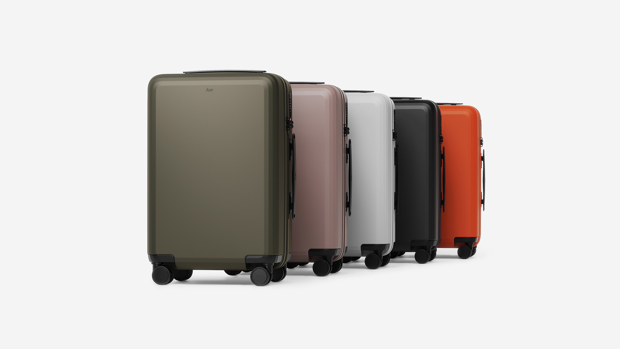
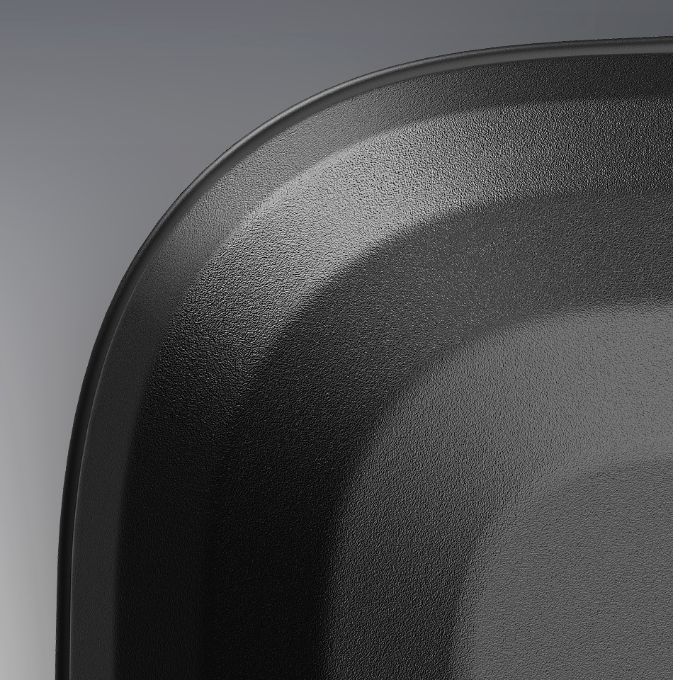
The balance of Form + Function comes to life through the details. The ultra‑durable Makrolon shell’s faceting is the first visual read, giving it structure, personality, and confidence (and inspired by the precise seams in Aer soft goods).
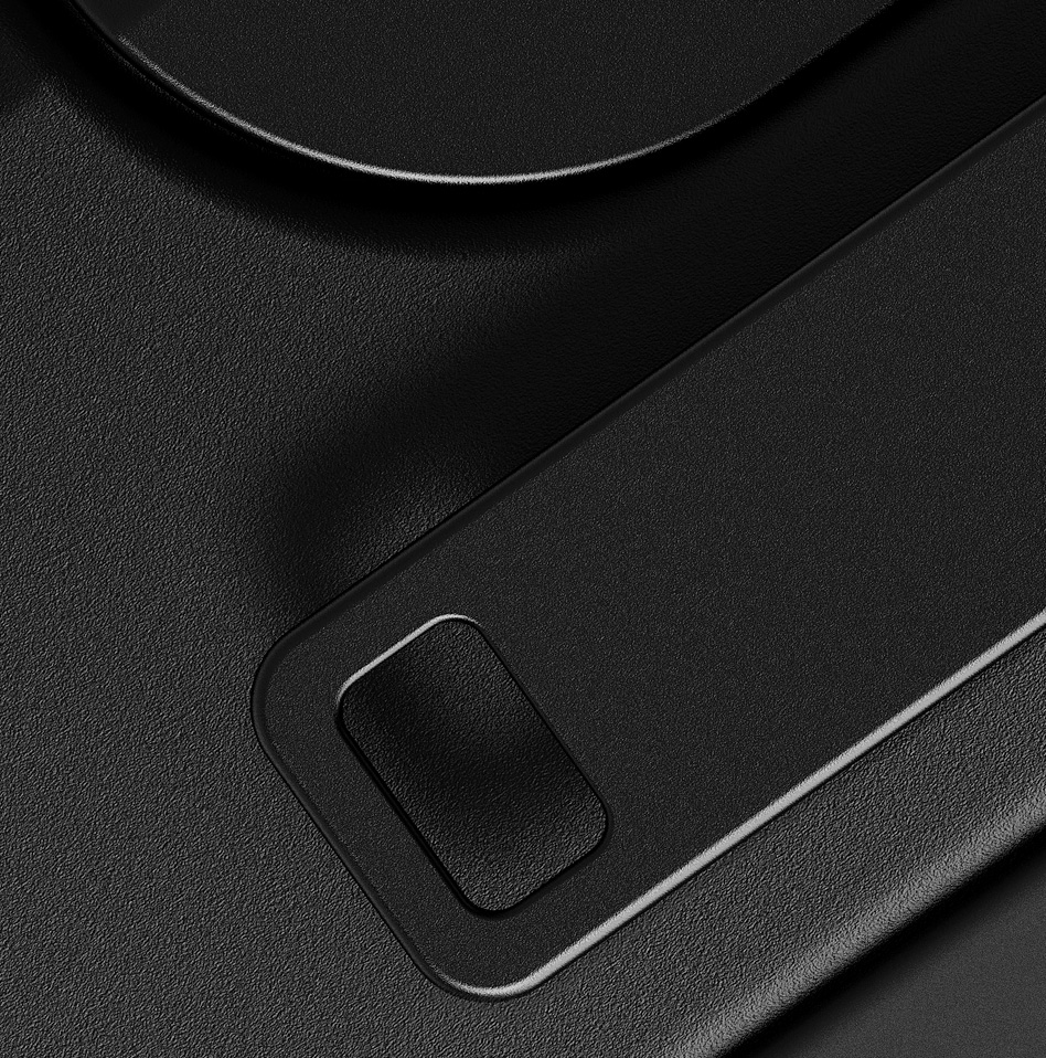
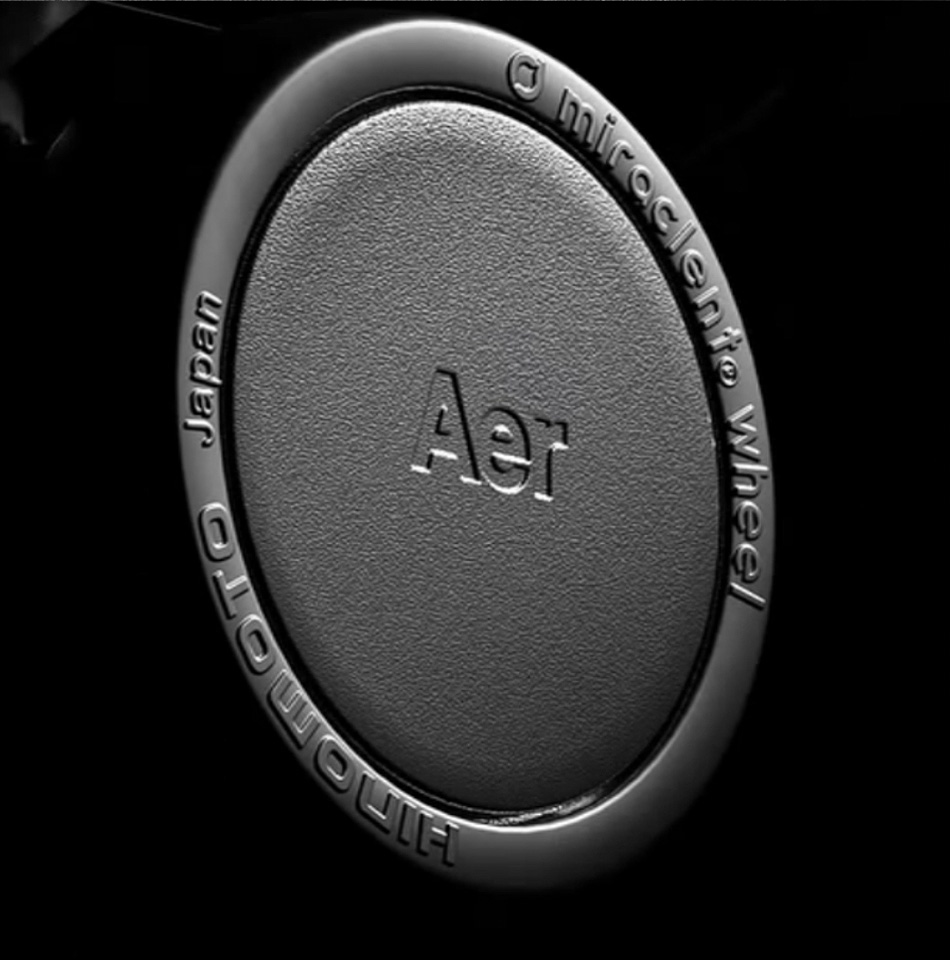
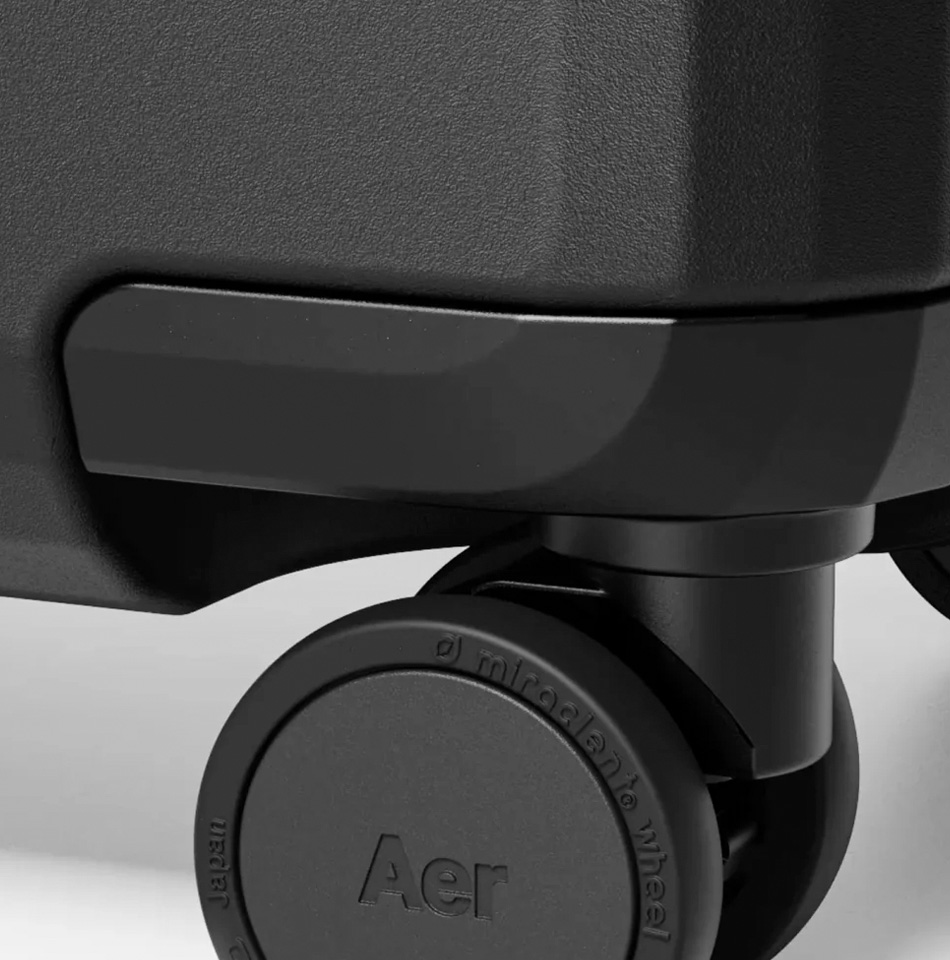
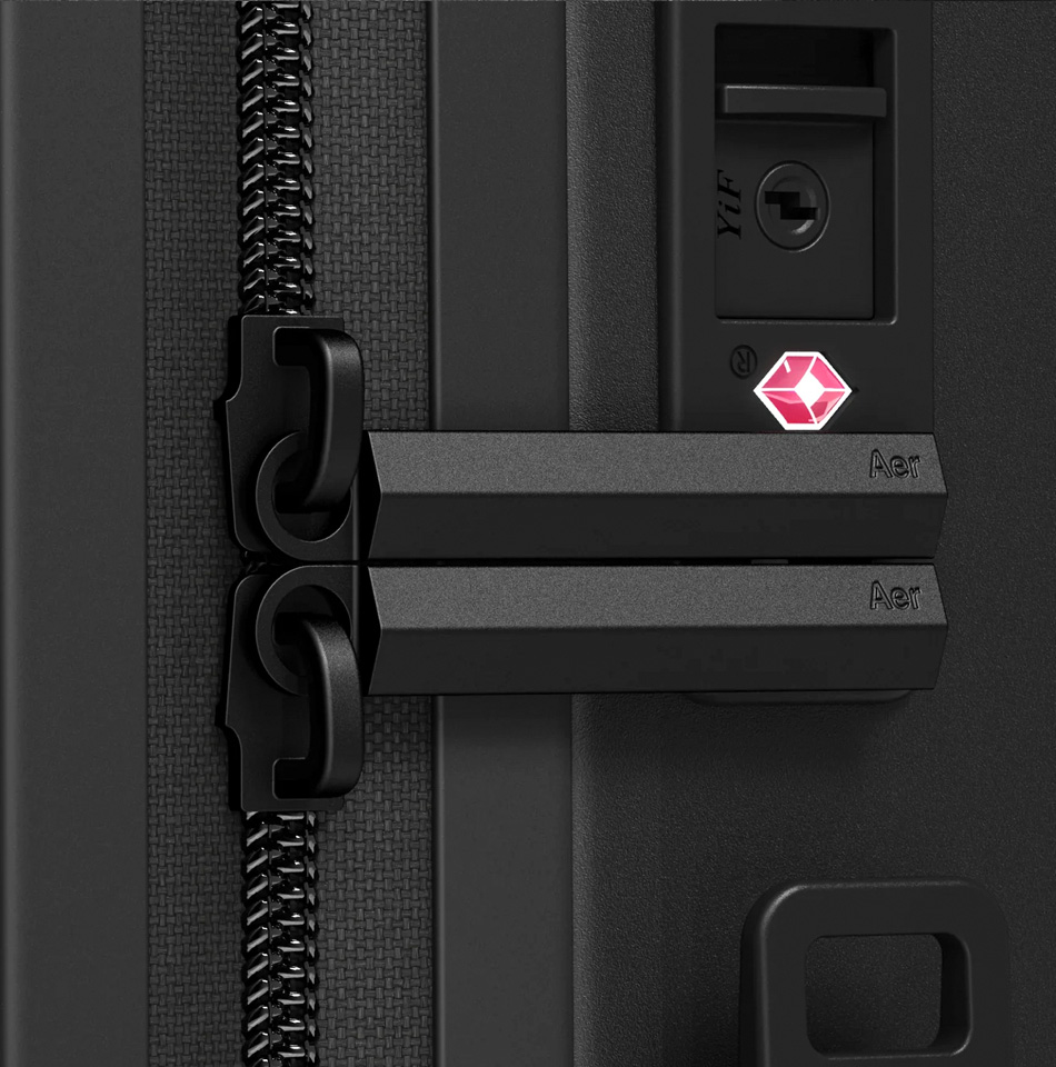
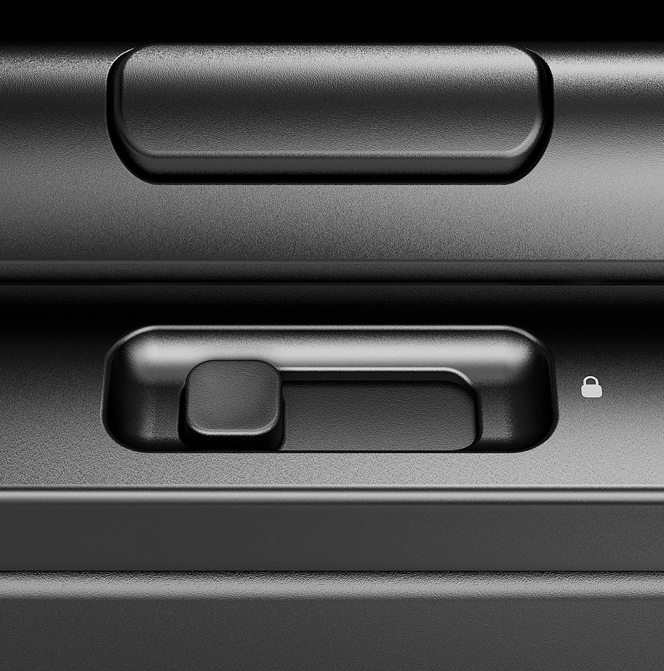
The touchpoints are the second read: The svelte top and side handles with the integrated bag tag loop; the side lock zippers for a more intuitive experience; the wheel lock to keep it under control!
.
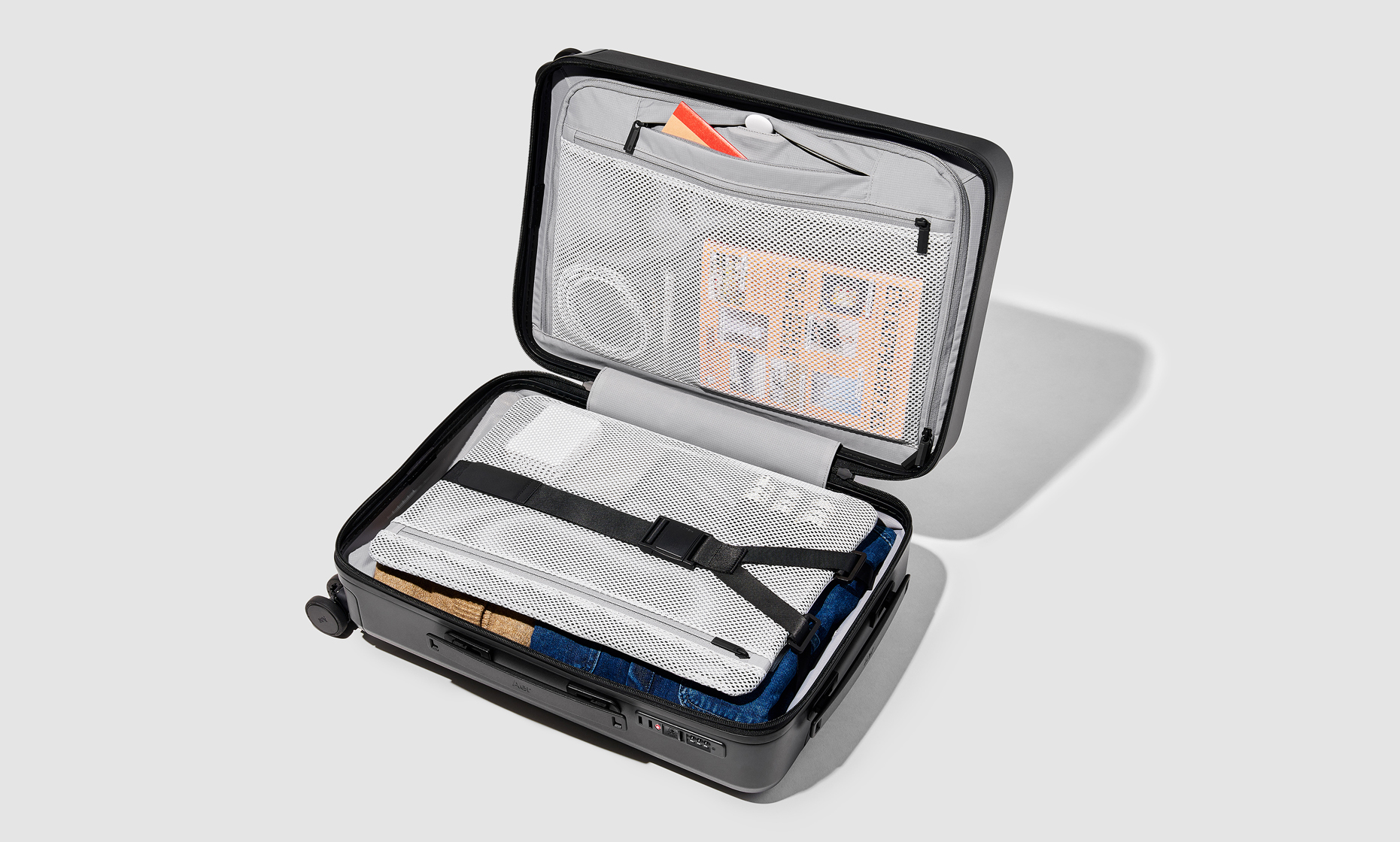
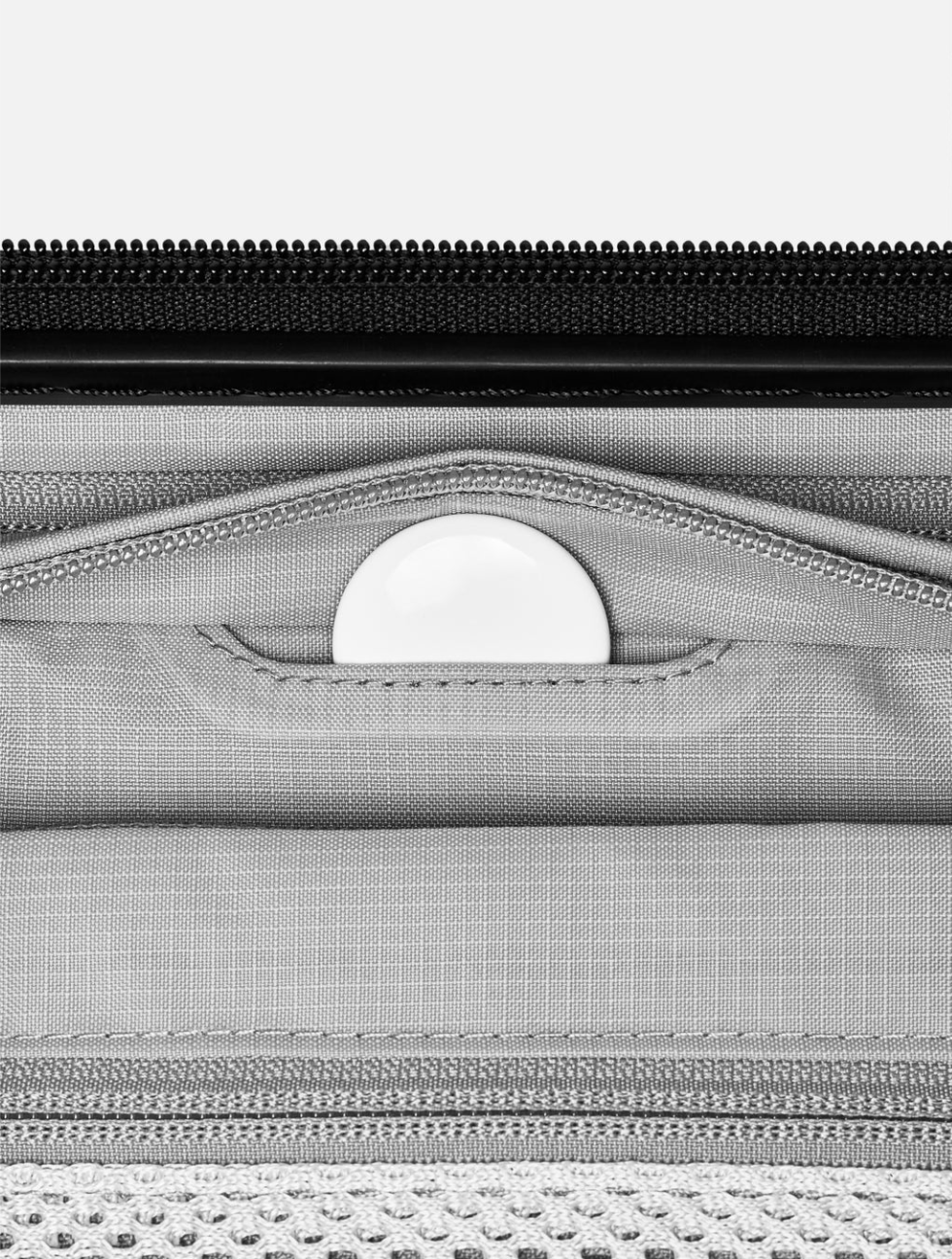
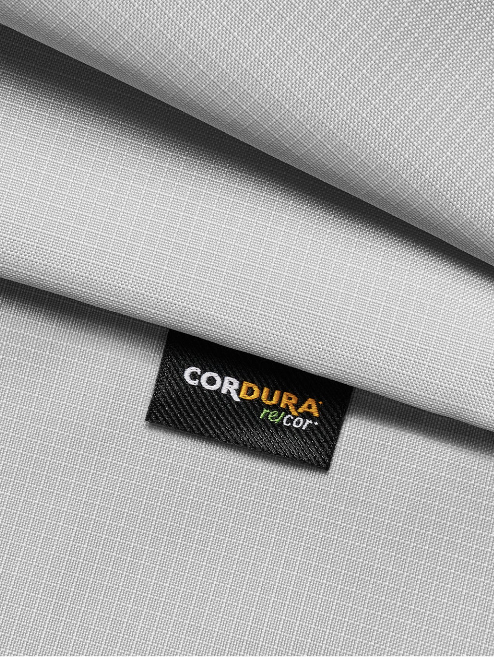
The interior is the third read and equally considered as the exterior. From the integration of the smart tracker pouch, to the Y‑clasp for secure packing, to the thoughtful selection of sustainable CORDURA® re/cor™ recycled nylon ripstop liner (bluesign® approved).
The all new Aer Carry‑On delivers quality in every aspect, from the design, materials, and experience. Enjoy!

Positive Impact
For this product line we knew we wanted to be mindful and incorporate performance‑based recycled materials that deliver a premium level of quality. The beautiful interior incorporates a sustainable CORDURA® re/cor™ recycled nylon ripstop liner (bluesign® approved).
