ZEISS
ZEN navx 2.0
- Information Architecture
- Interface Design
- UIUX
- 3D Animations
- Creative Direction
The Client's Challenge
Build upon the success of ZEN navx 1.0, enhance the interface design, usability, and the end to end workflow for ZEISS Versa operators. Bring cognitive clarity to the Scout & Scan dashboard as a central decision point for all operators, and update the core nav experience for the macro and micro steps to improve the experience and yield better results for global non‑destructive imaging based research.
The Design Approach
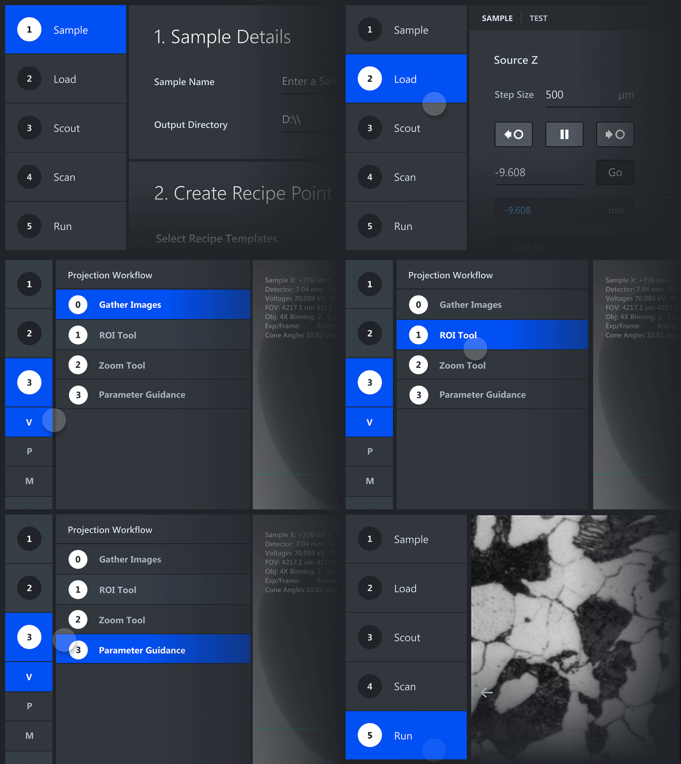
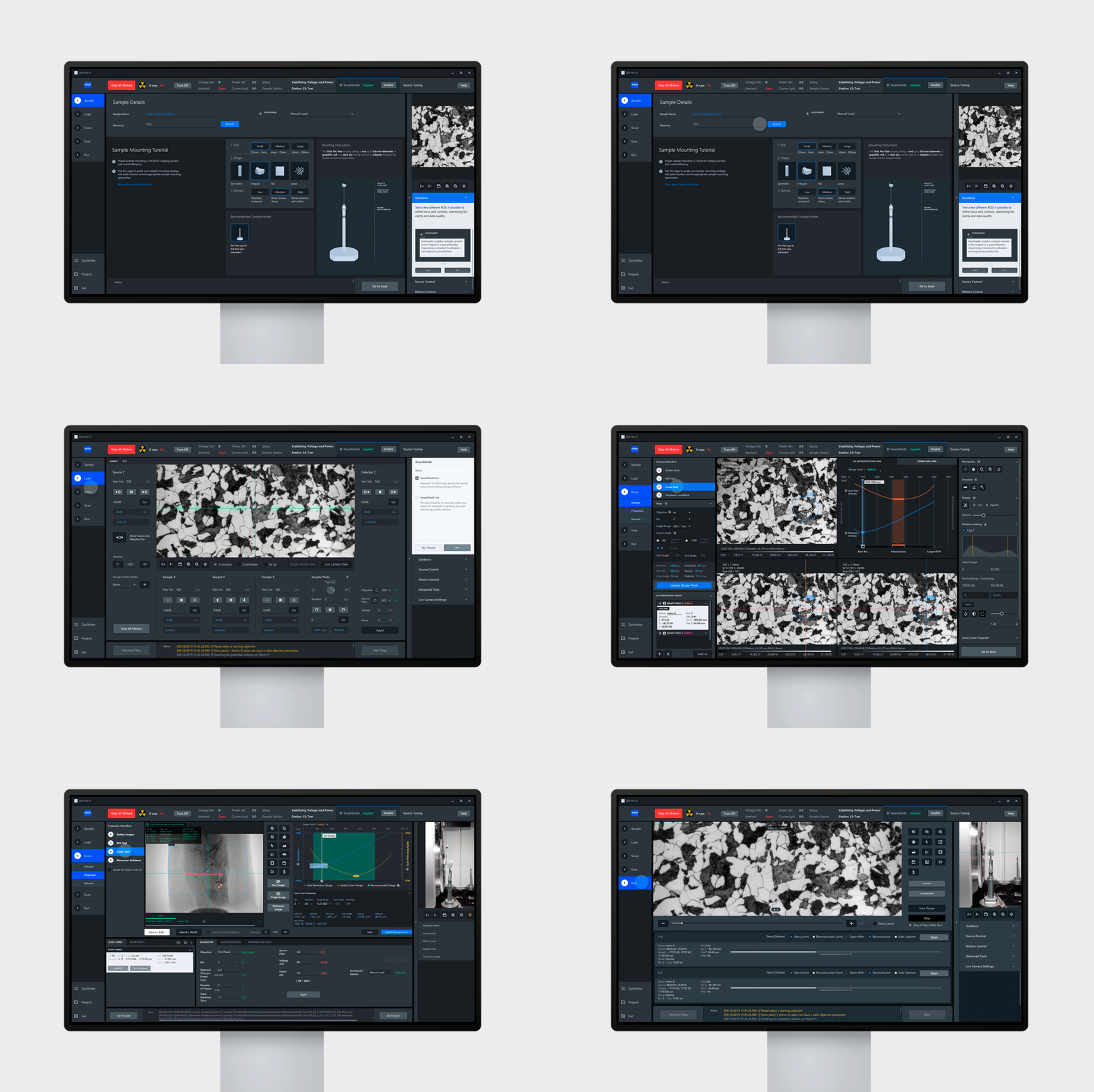
In close collaboration with our digital design partners Airlift and informed by operator feedback, we resolved central usability complexities. We evolved the left navigation structure by incorporating an expand/collapse interaction paradigm combined with improved color hierarchy, resulting in clearer macro and micro steps for operators leading to reduced cognitive friction and improved results.
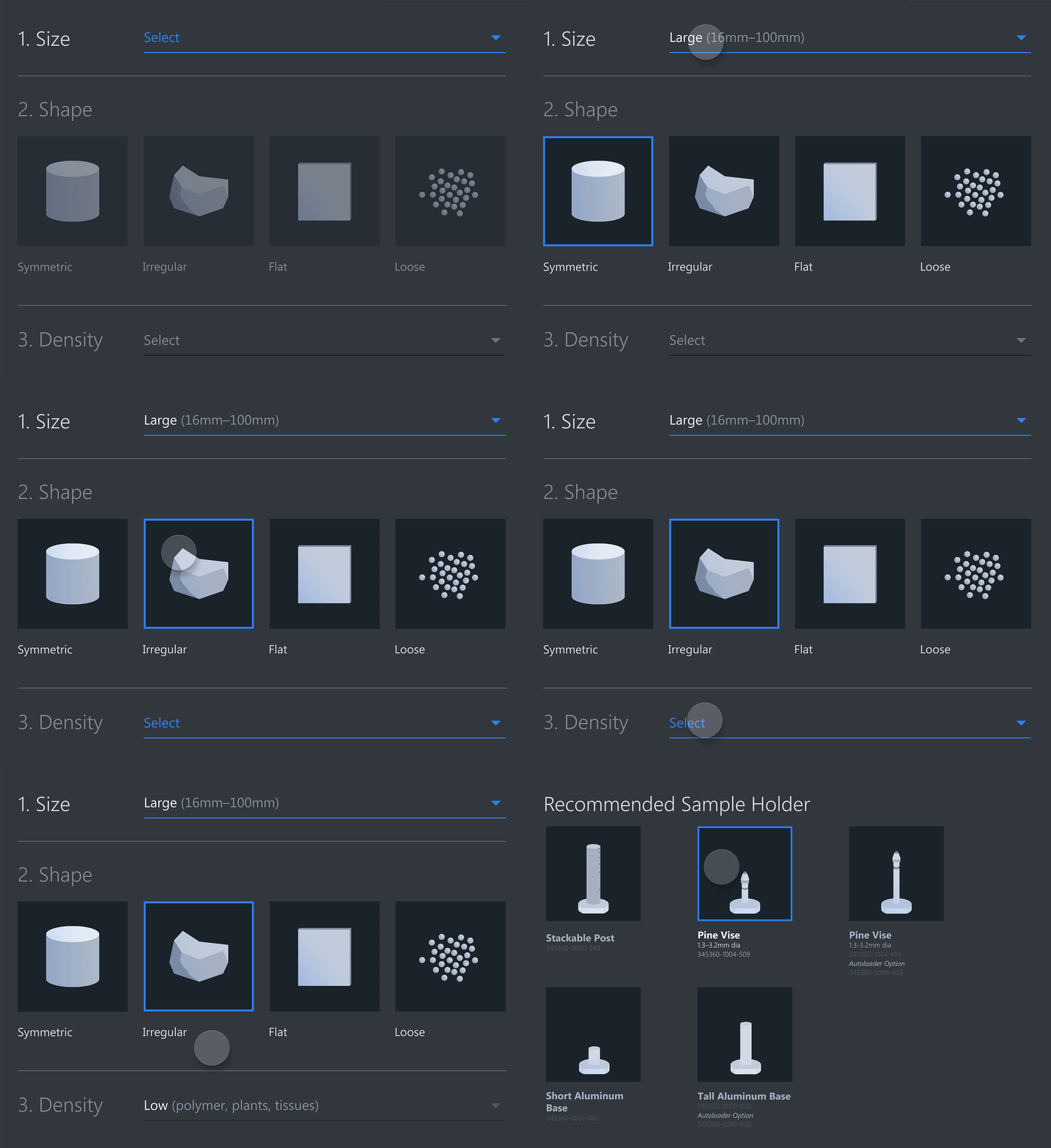
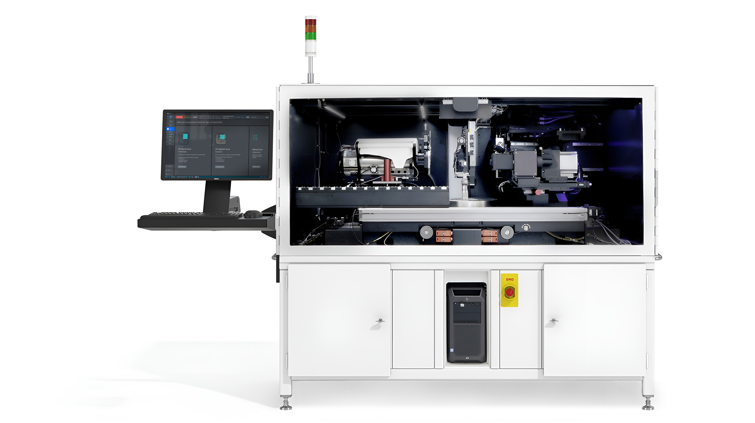
For the Scout & Scan dashboard our team designed custom 3D animations that provide clearer visual representation of the workflow choices. Our combined team of Box Clever x Airlift continues to work closely with ZEISS to ensure ZEN navx evolves as we iteratively learn from operators, to ensure it remains best‑in‑class.
Before
After
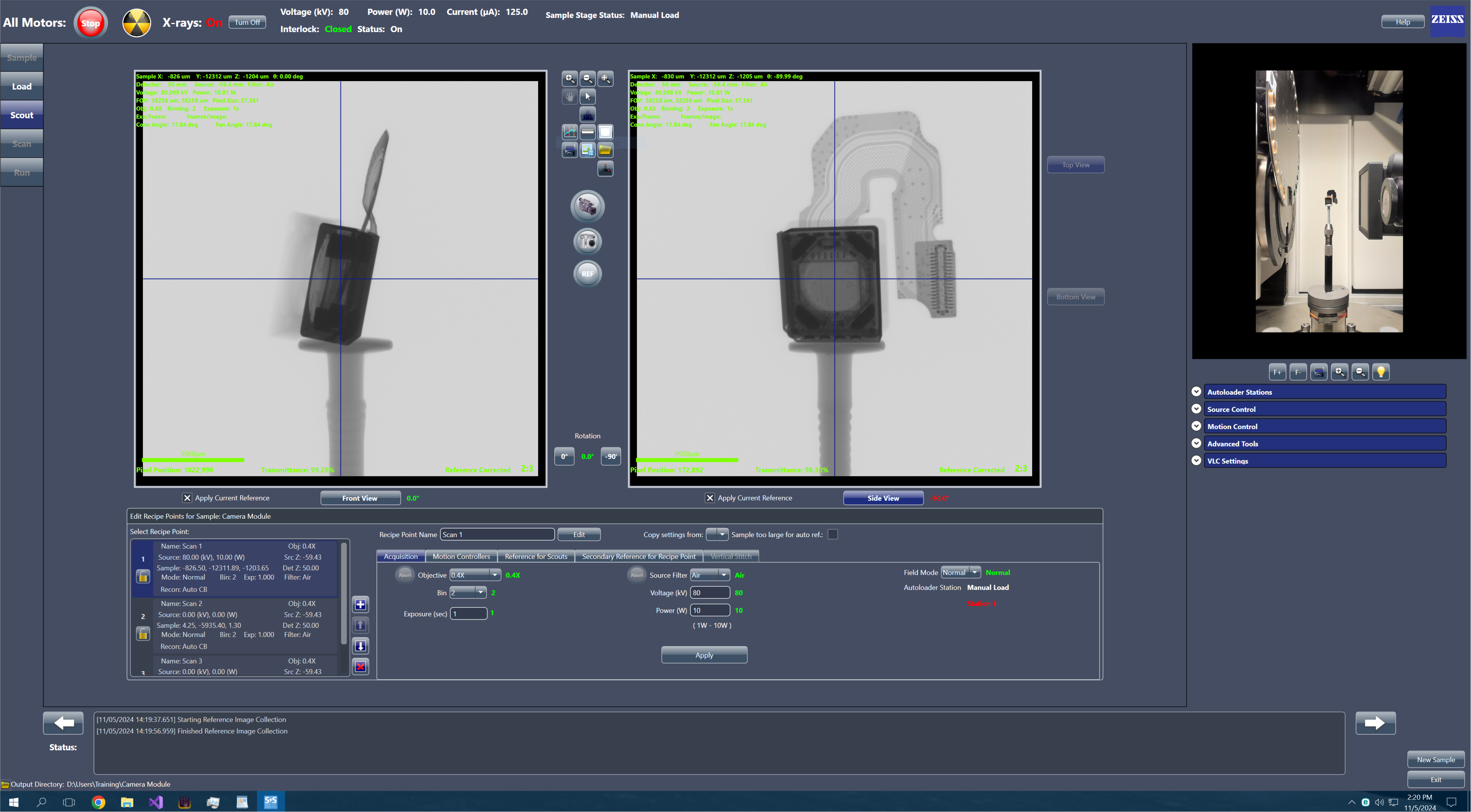
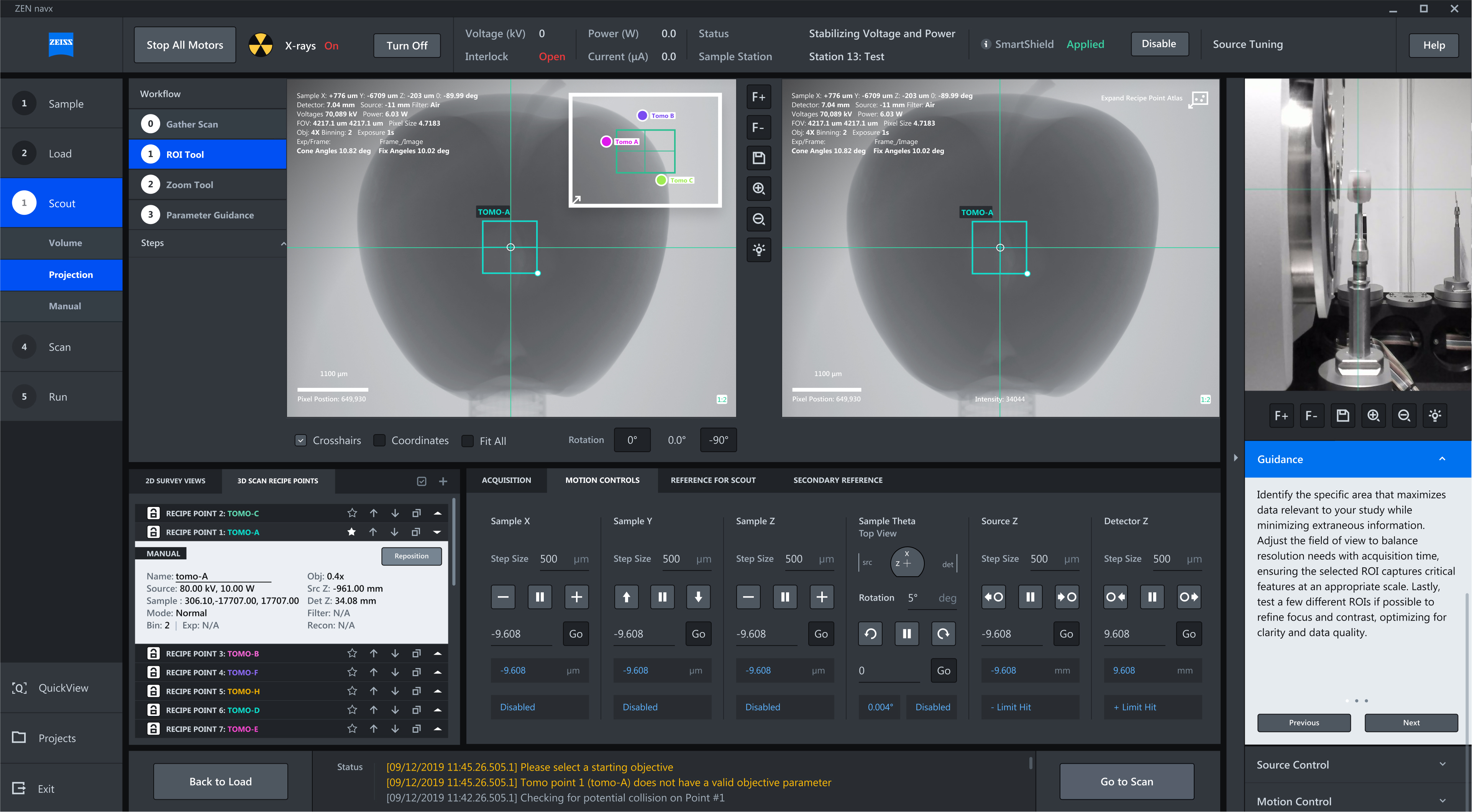
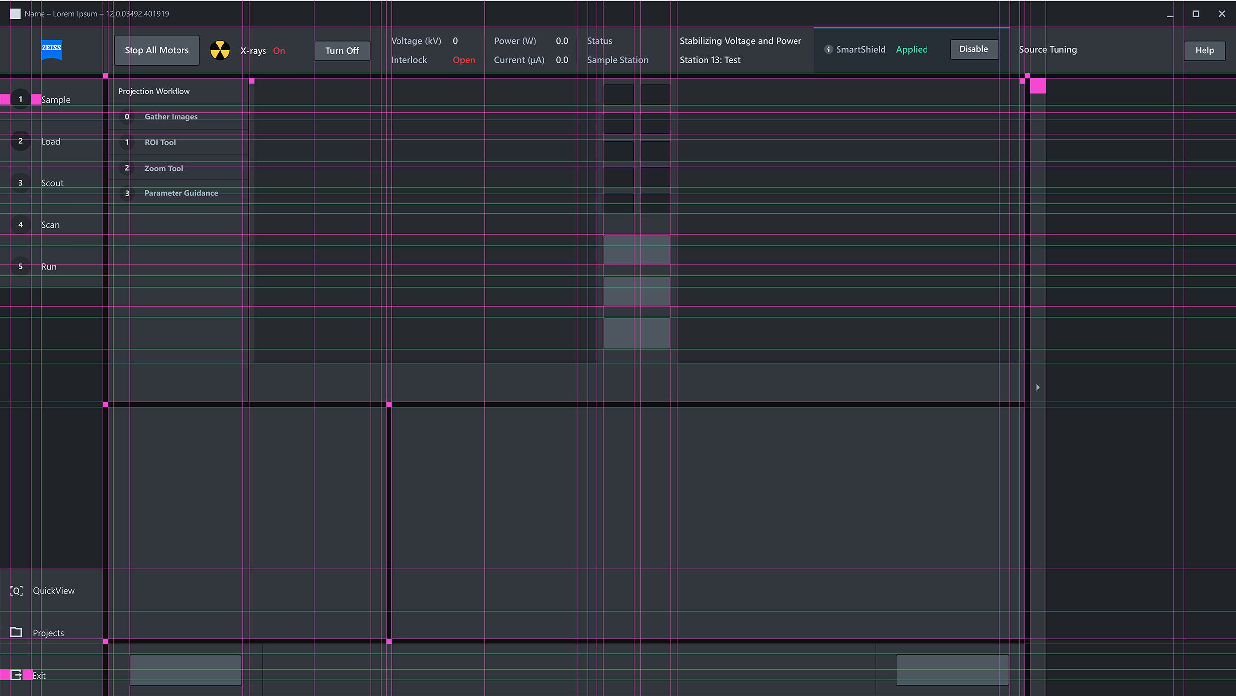
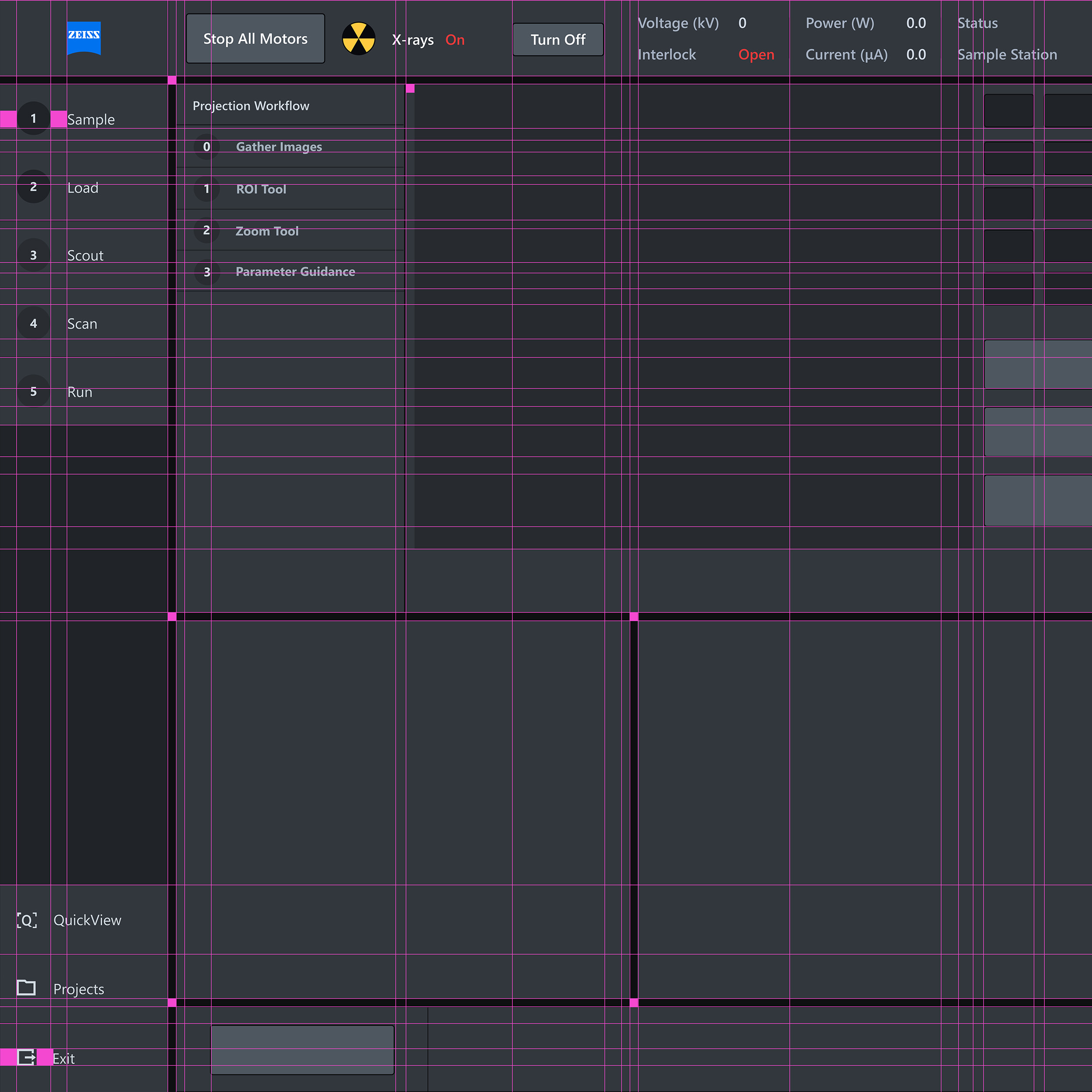
Optimized Workflows + Grid
With 2.0 we have further optimized the underlying grid that creates order and hierarchy to the interface design. A refreshed left hand nav now creates clarity to the macro and micro steps, and delivers more pixels so the images can be the focal point of the experience.
